Charts with Japanese Labels with Pandas and Matplotlib
Jupyter notebook with the code from this article
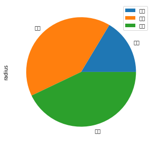
Using pandas and python, it’s very easy to make a quick chart. But if the labels are written in Japanese the chart labels might end up being garbled. These are called mojibake (文字化け), or sometimes more affectionally, tofu (豆腐) due to their resemblance to blocks of tofu.
planetsJapanese = pd.DataFrame({'mass': [0.330, 4.87 , 5.97],
                   'radius': [2439.7, 6051.8, 6378.1]},
                    index=['水星', '金星', '地球'])
plot = planetsJapanese.plot.pie(y='radius', figsize=(5, 5))

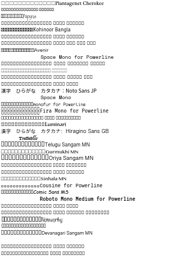
If you’re using Japanese regularly, your system probably has fonts installed to render the text correctly. This snippet of code will make a chart with every font with some Japanese sample text so you can see which are rendered correctly.
import matplotlib
import matplotlib.pyplot as plt

fonts = set([f.name for f in matplotlib.font_manager.fontManager.ttflist])

plt.figure(figsize=(10,len(fonts)/4))

for i, font in enumerate(fonts):
    try:
        plt.text(0, i, f"漢字 ひらがな カタカナ:{font}", fontname=font)
    except:
        print(font)

plt.ylim(0, len(fonts))
plt.axis("off")

plt.show()

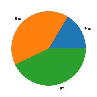
By selecting one of the fonts from the list and passing it as the fontfamily property you can make the chart render correctly.
import matplotlib.pyplot as plt

plt.figure(facecolor='white',figsize=(6,6))
plt.pie(planetsJapanese['radius'],
        labels=planetsJapanese.index,

        textprops={'fontfamily':'Noto Sans JP','fontsize': 12})
